Notes on Magic Ink: Information Software and the Graphical Interface
What You See is All You Get (WYSIAYG)
- UI design is:
- How information is presented: Graphic Design
- Personal accounting, Health app visualization
- How to manipulate and create: Industrial design
- Photoshop, Illustrator
- How information is presented: Graphic Design
- Users mostly want to learn something, not create something. ⇒ Graphic design > Industrial design. ⇒ How information is presented > How to create new things
- Thus, paper graphic design is not only relevant, but is a baseline
Example
If a person is in the mood for a movie, what questions might she have?
- What movies are showing today, at which times?
- What movies are showing around a particular time?
- Where are they showing?
- What are they about?
- Are they good?
Consider this redesign.

- Timeline visualizes and invites time comparisons
- “What is showing” is boldly presented
- Cinemas are color-coded for easy comparison
Context-Sensitive Graphics
- Digital interfaces are better than paper because information is context-sensitive.
- It can link to more information (instead of having to search paper)
- It can present data in different ways according to what the user needs (instead of being static data on paper)
Interactivity is Bad
- For all information software, interaction == navigation in data-space
- Contextual software should already know what user wants
- Navigation is effortful and bad.
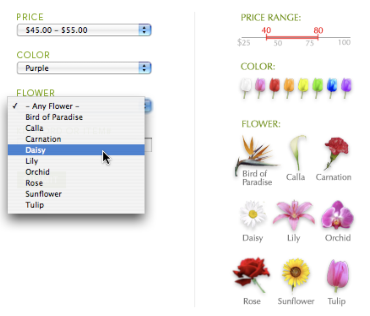
- To reduce manipulation…
- Context-Sensitive Specialized Controls:
- Tight Feedback loops (immediate results)